
Looking through Pinterest for 2026 color palettes for their bedrooms consists of more than just picking a ‘nice’ color. It is constructing a space that works with your life, sleep, and personal style. Americans are saving palettes that feel personal, for example, neutrals and deep greens. Below are 10 unique color schemes with styling so that you can coordinate paint, textiles, and furniture.
1. Layers Of Mauve Linen With A Beige Headboard
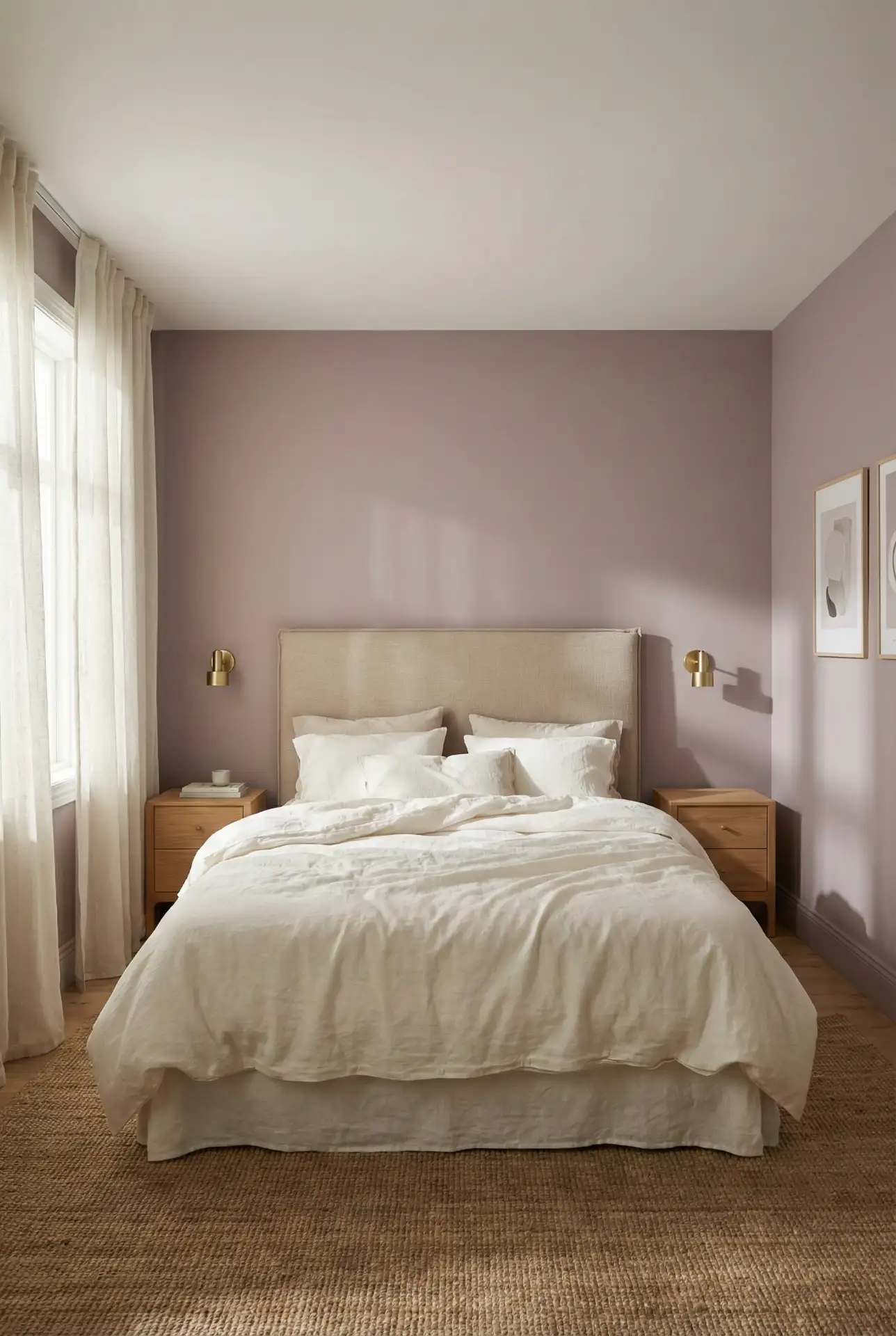
A soft Mauve wall wash and a Beige headboard give a bedroom a gentle, modern romance without turning sugary. Keep the palette slightly dusty—think rose-taupe textiles, warm whites, and light oak—so the look stays airy. This scheme shines when you add one quiet contrast, like matte black hardware or a pale stone lamp. 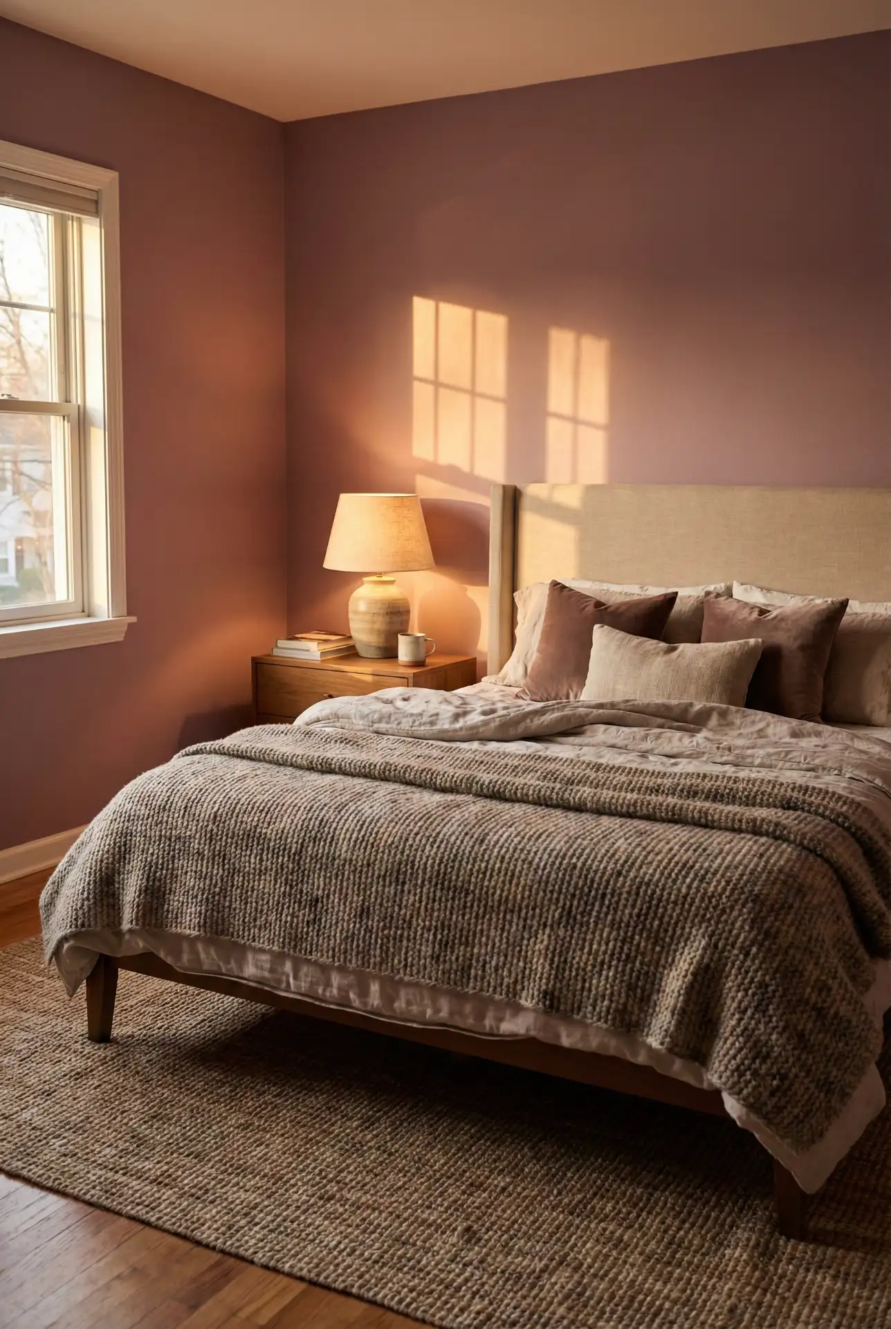
If you’re testing this scheme, start with bedding and one paint sample before committing. A mauve that looks perfect online can skew purple at night; balance it with creamy whites and natural wood so it reads like a soft neutral. The beige headboard is the anchor—choose a fabric with texture (bouclé, linen blend) so the palette feels intentional, not flat.
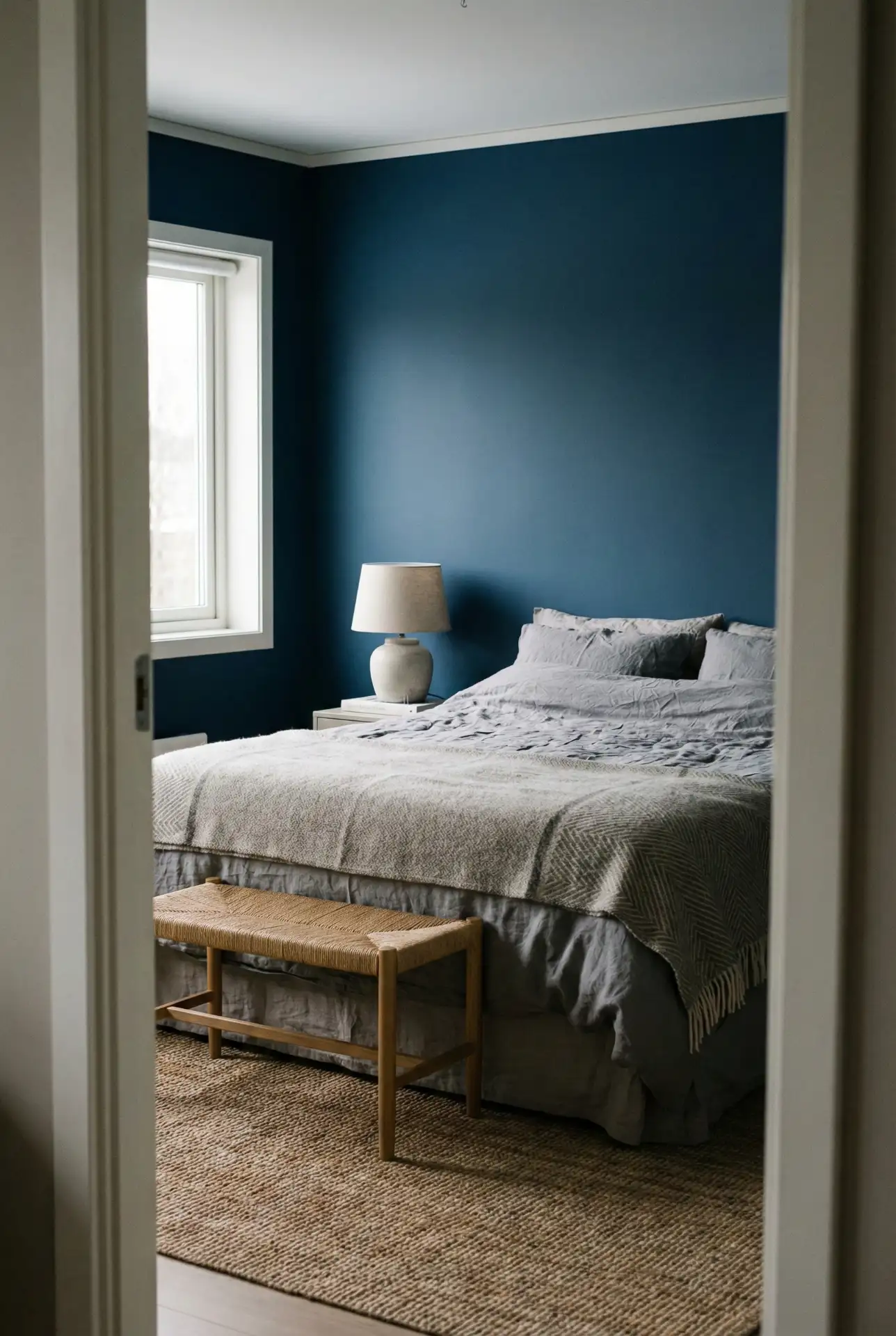
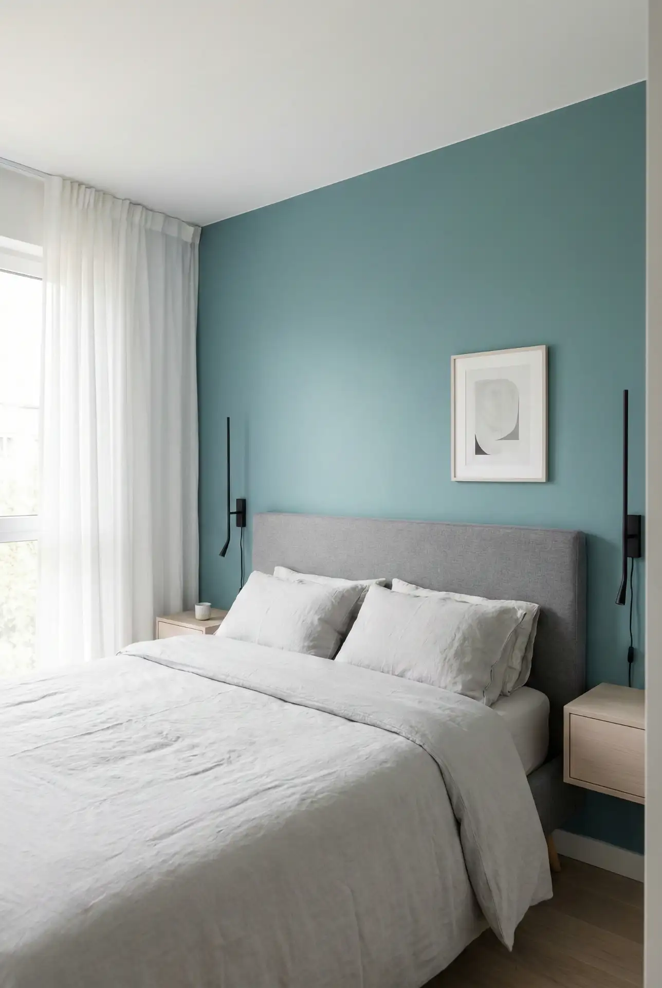
2. Teal Accent Wall With A Black Headboard Edge
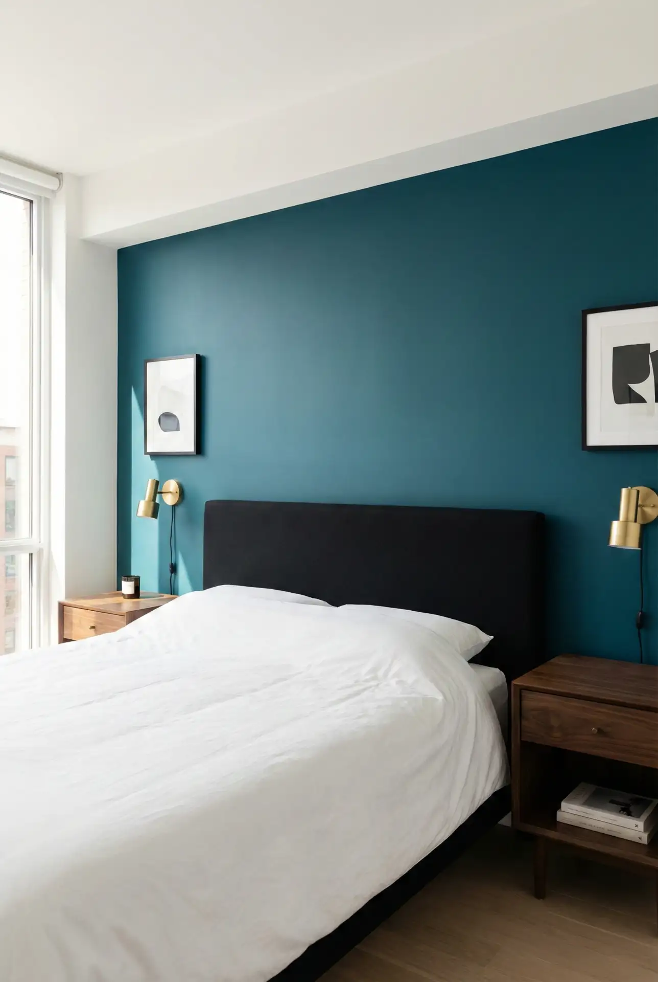
A deep Teal accent wall looks crisp and graphic when it’s framed by a Black headboard , especially in rooms that need a little drama. Keep everything else restrained: warm white bedding, walnut tones, and one metallic note. This is a strong “Pinterest palette” because the contrast reads clearly in photos without relying on trendy clutter. 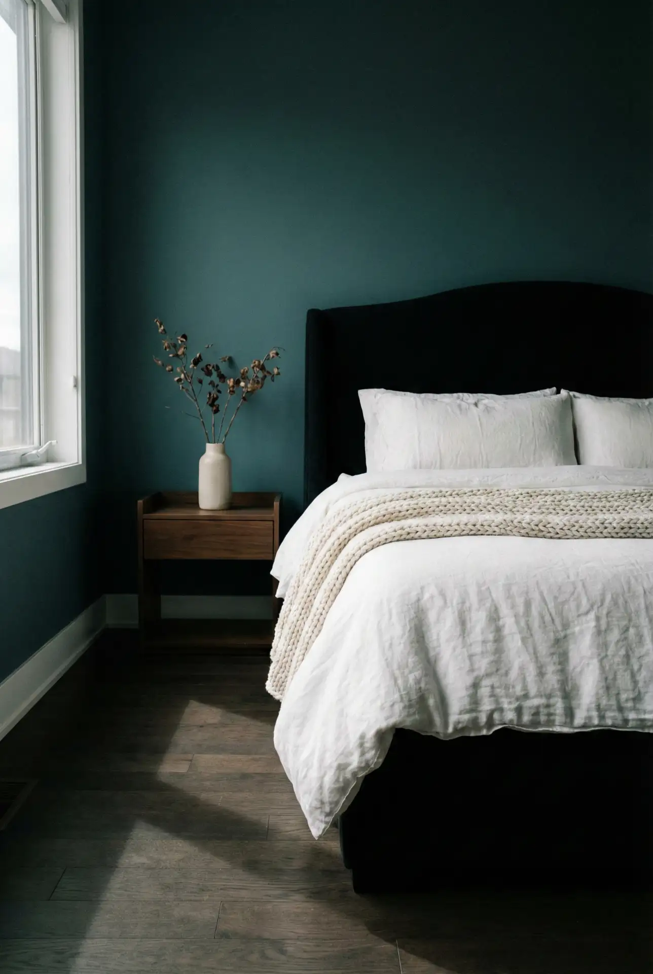
Designers often recommend choosing teal with a hint of gray so it won’t turn jewel-toned and harsh in a bedroom. To achieve a more relaxed vibe, choose a warm natural element, such as rattan, linen shades, or a wool rug, so the black headboard doesn’t look too sharp. Think “tailored” rather than “theatrical,” and the palette stays timeless.
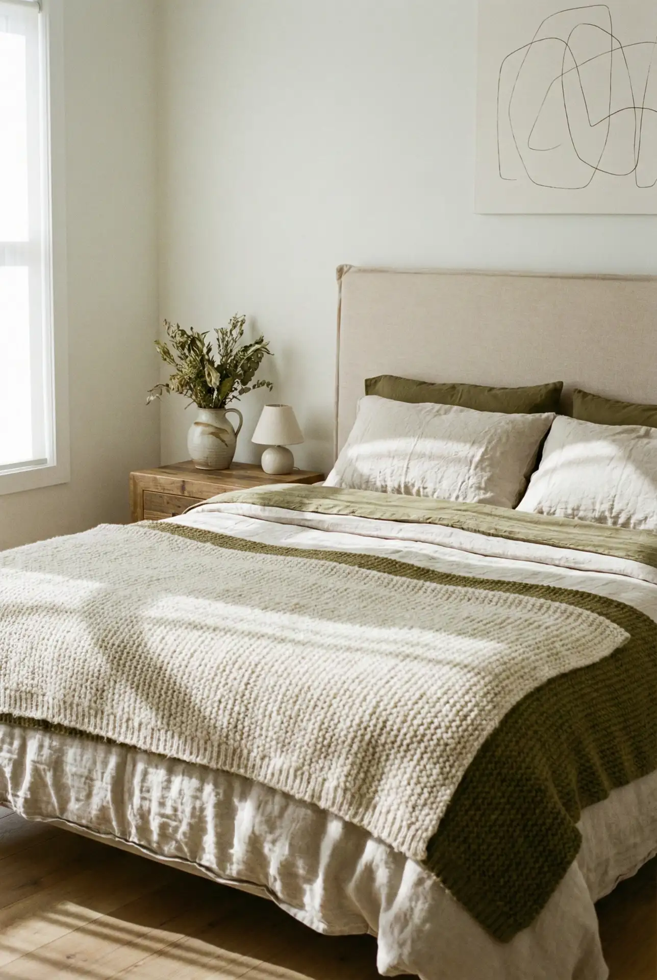
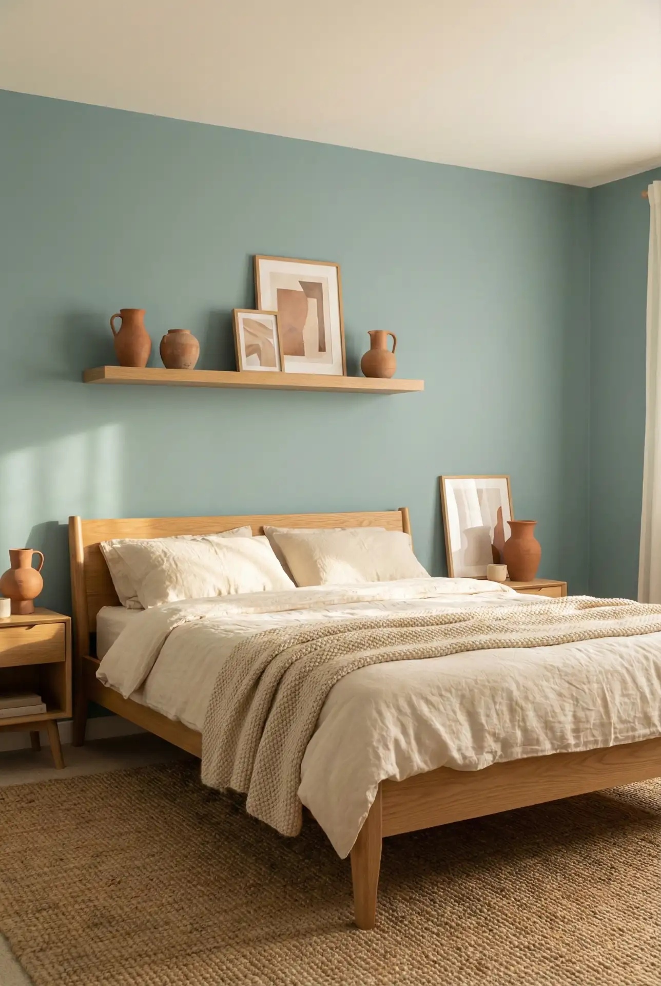
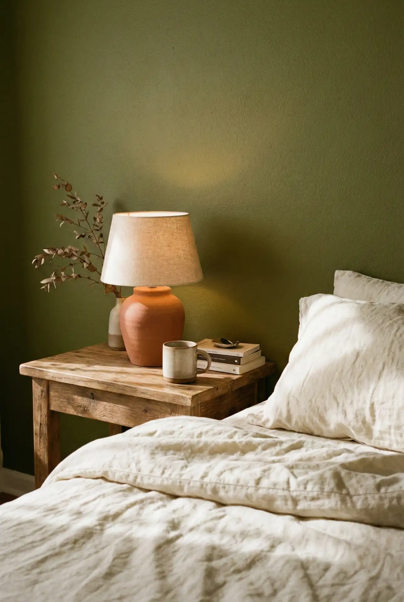
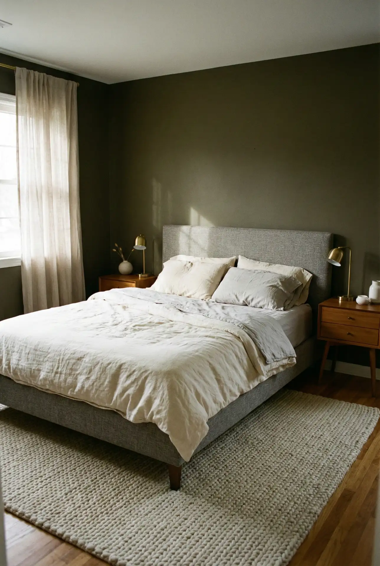
3. Olive Green Calm For Couples With Earthy Neutrals
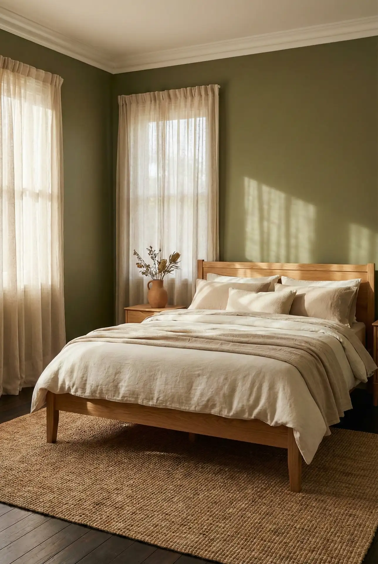
For Couples who want a bedroom that feels grounded, Olive green is the sweet spot—soft enough to live with, but distinct from beige. Pair it with Earthy textures like woven shades, clay ceramics, and natural linen. The goal is a palette that looks curated yet forgiving, where every piece feels warm instead of “matched.” 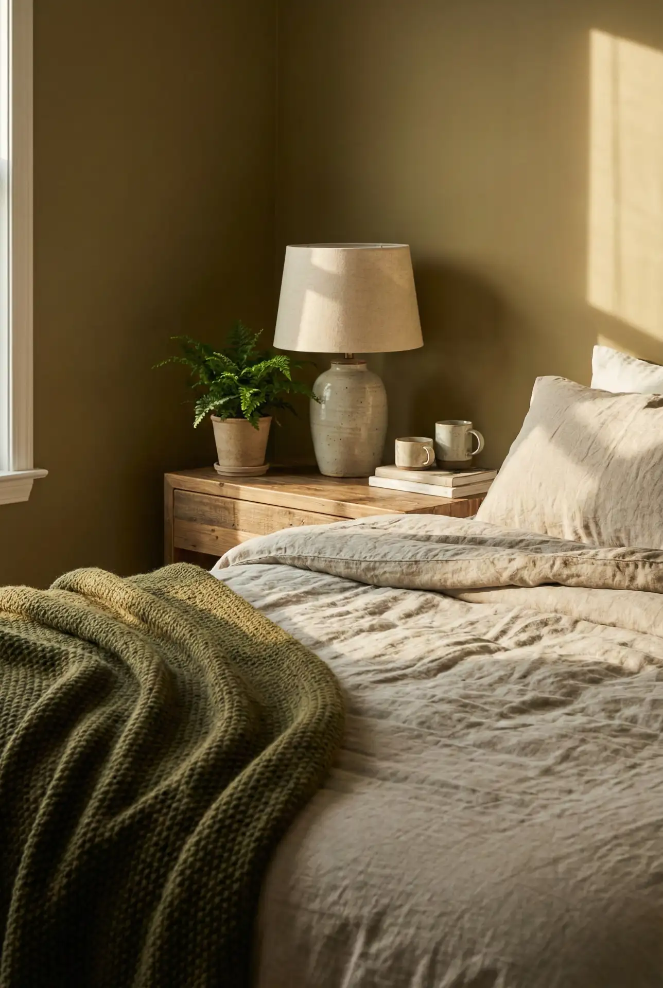
Where it works best: olive looks especially good in bedrooms with medium wood floors, lots of daylight, or views of trees—anything that echoes nature outside. In very dim rooms, choose a lighter olive to avoid a murky cast. If you share the room, keep the big pieces neutral (bed, rug, curtains) and let olive be the unifying color that doesn’t overpower either person’s style.
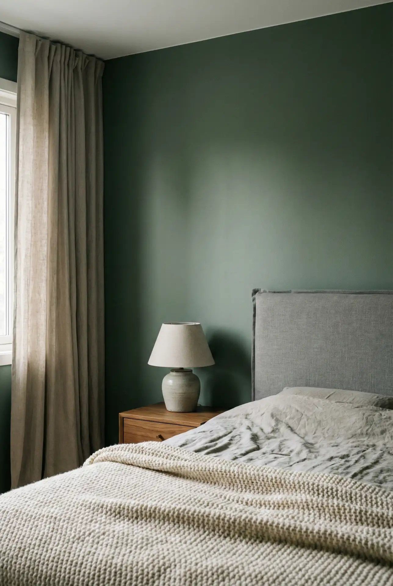
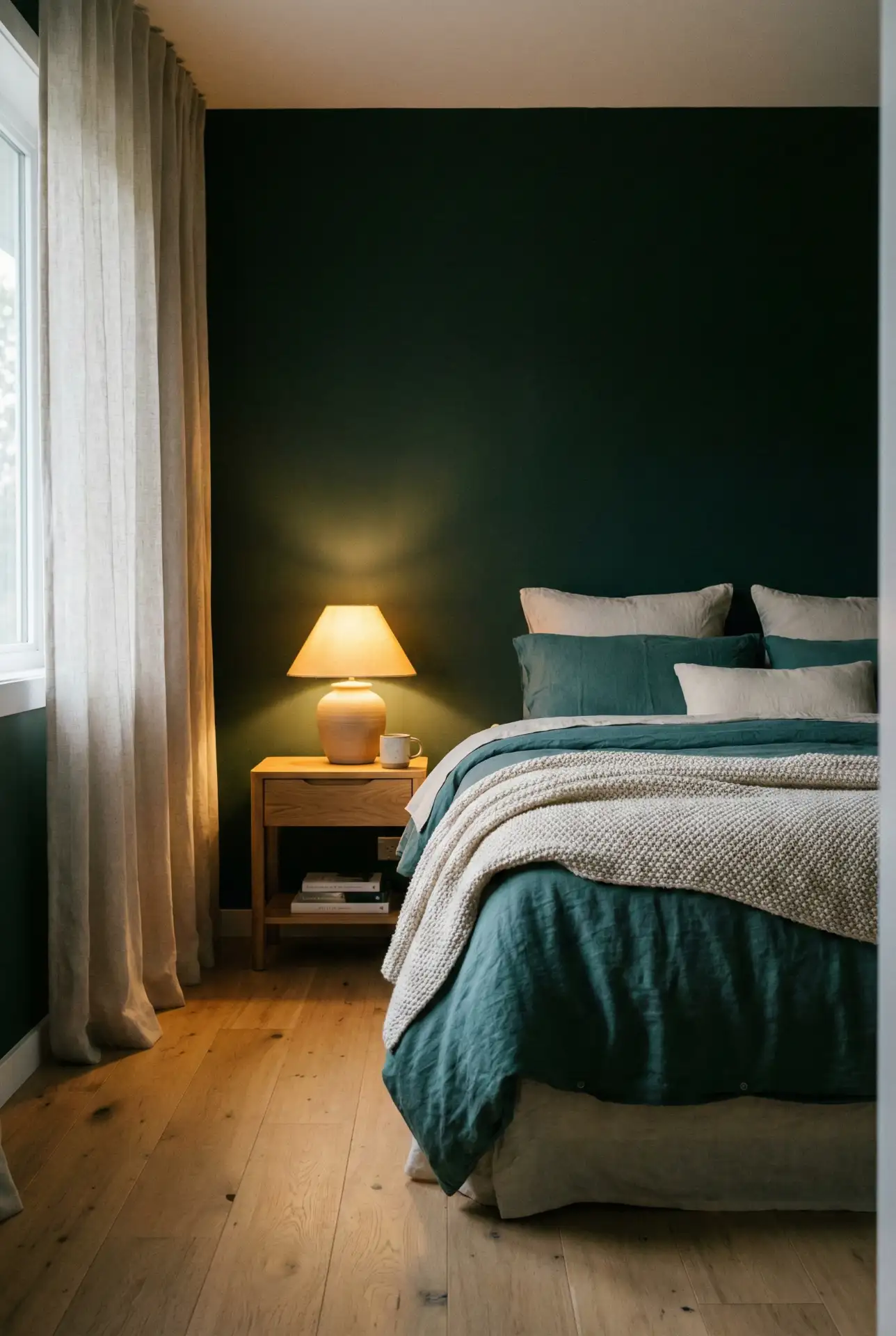
4. Forest Green Elegance With Farrow And Ball-Inspired Depth
A Forest green bedroom can feel quietly luxurious when it’s done in a more Classy , softened tone—think heritage paint energy, like Farrow and ball rooms you’ve pinned for years. Add cream bedding, dark-stained wood, and a single antique element (mirror, framed print) to make the color feel collected, not heavy. 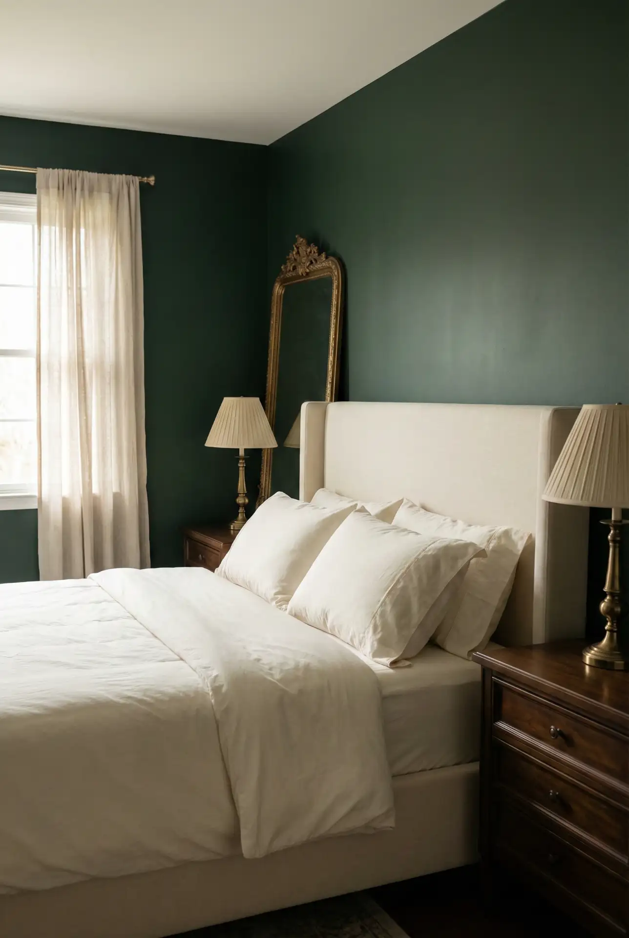
Budget-wise, you don’t need specialty paint to get this look—what matters is the undertone. Some nice finishes and smooth painting jobs deserve higher-quality spending, like paint rollers and brushes, and some decent lamps to warm up the deep green at night. If you want to choose paint or some objects made of nice materials, and you consider the nice materials option as more expensive, then paint acts as the more inexpensive option that deserves lots of attention, and then linen curtains as the nice materials option elevate the space and give the area nice vibes.
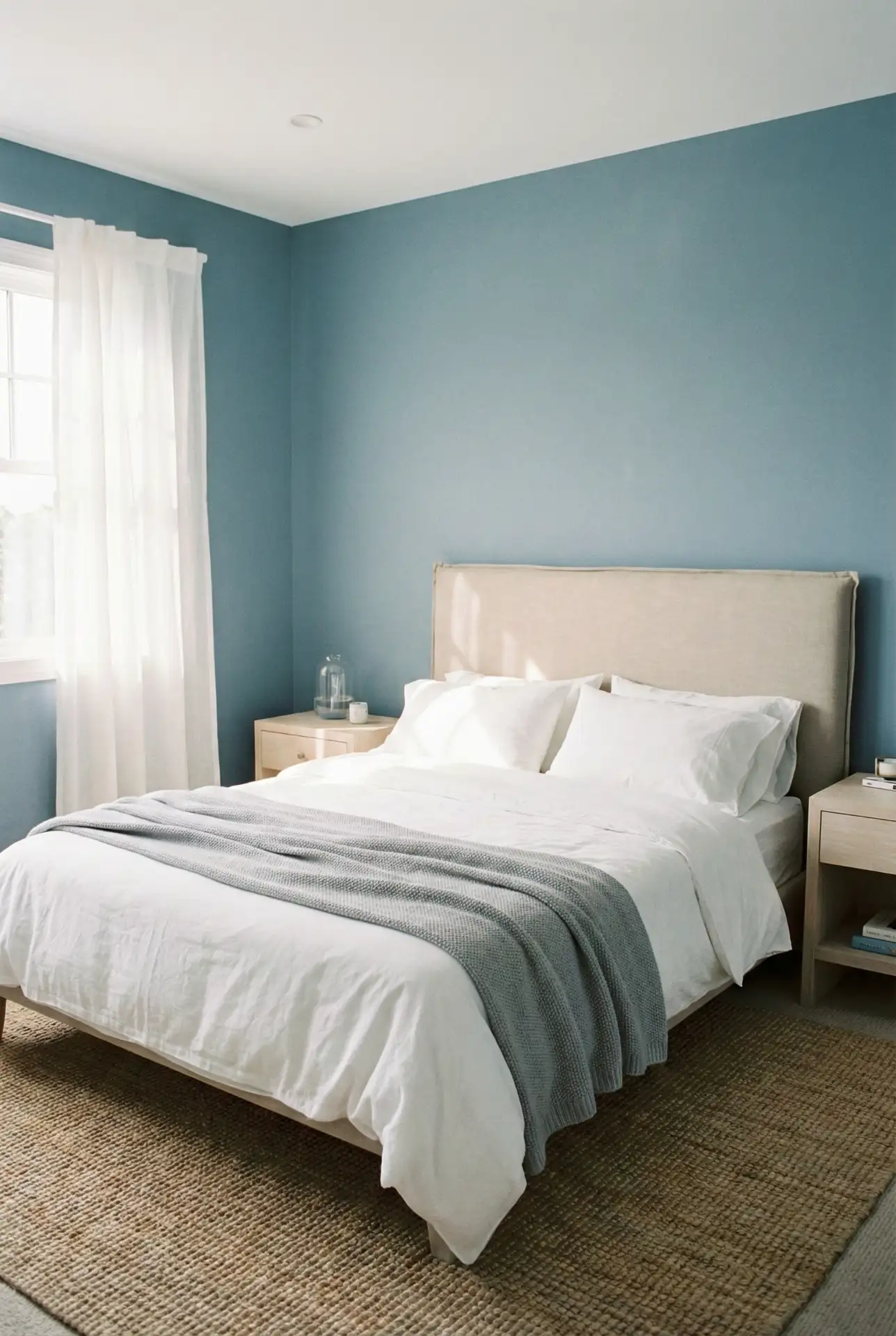
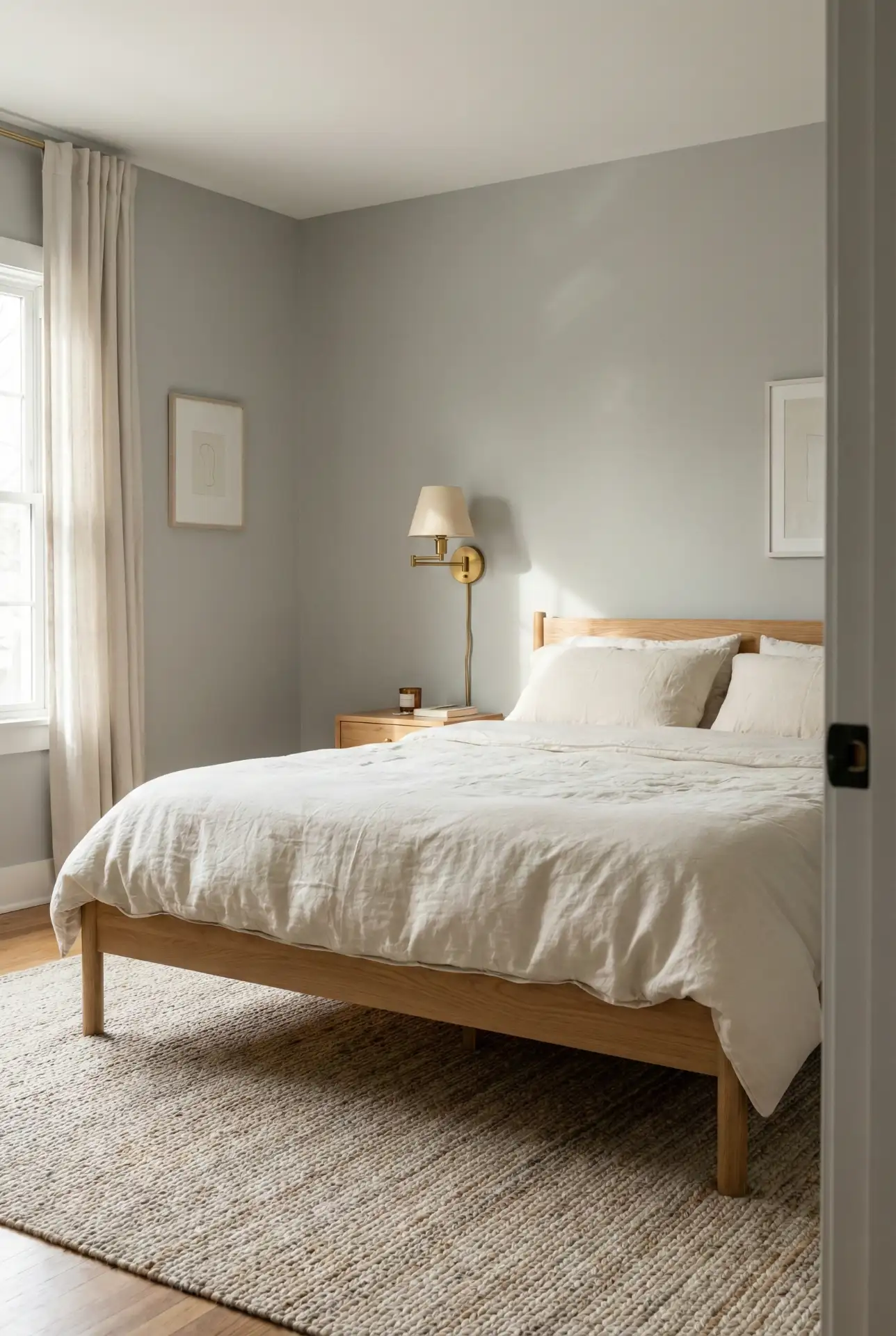
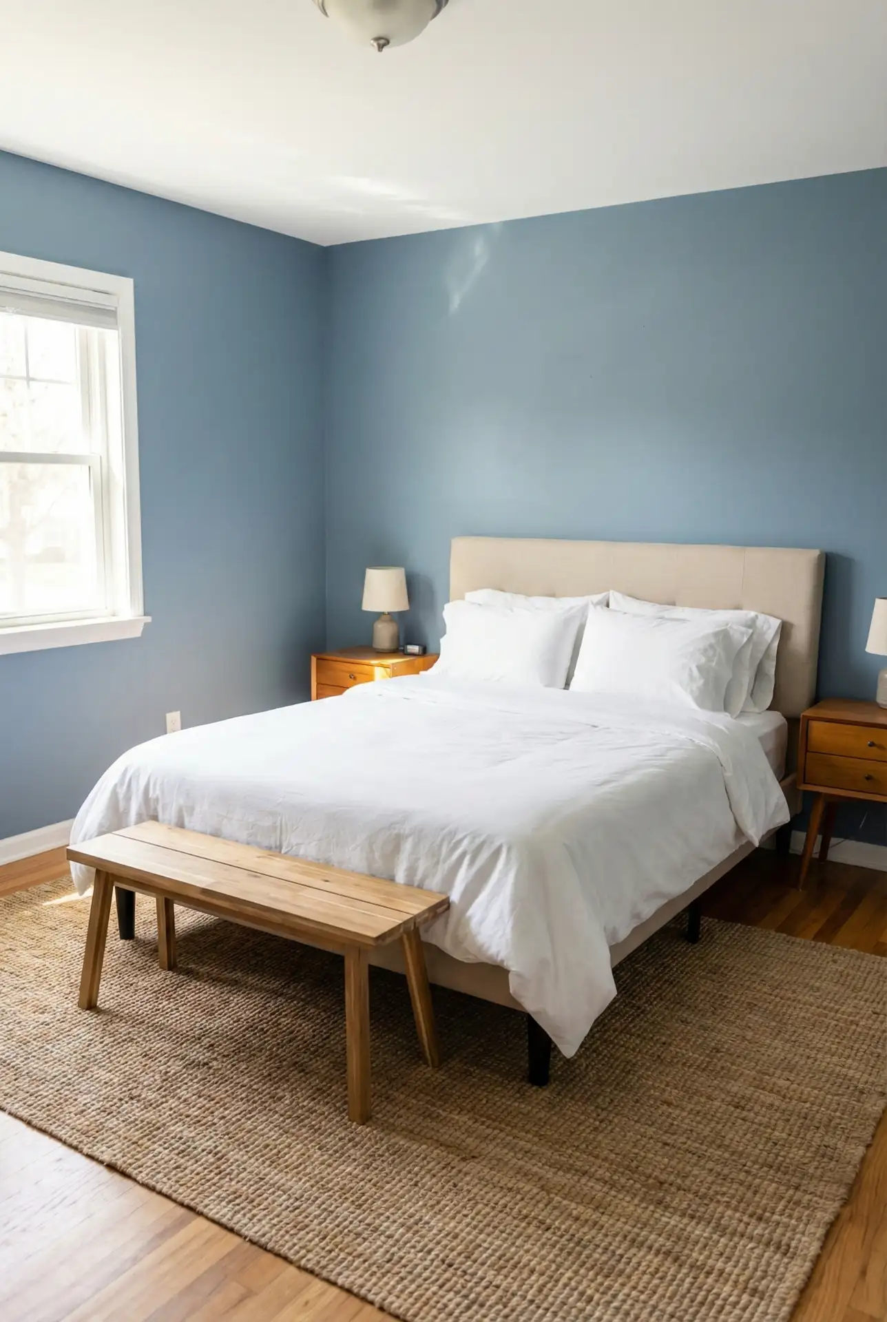
5. Blue And Grey Serenity For A Guest Bedroom That Always Feels Fresh
A Blue and Grey palette is a reliable win for a Guest bedroom because it reads clean, calming, and universally appealing. Choose a softened denim blue for the walls, then layer light gray bedding, crisp white sheets, and a simple wood nightstand. Add a small accent—like a patterned throw—to keep it from feeling too “hotel.” 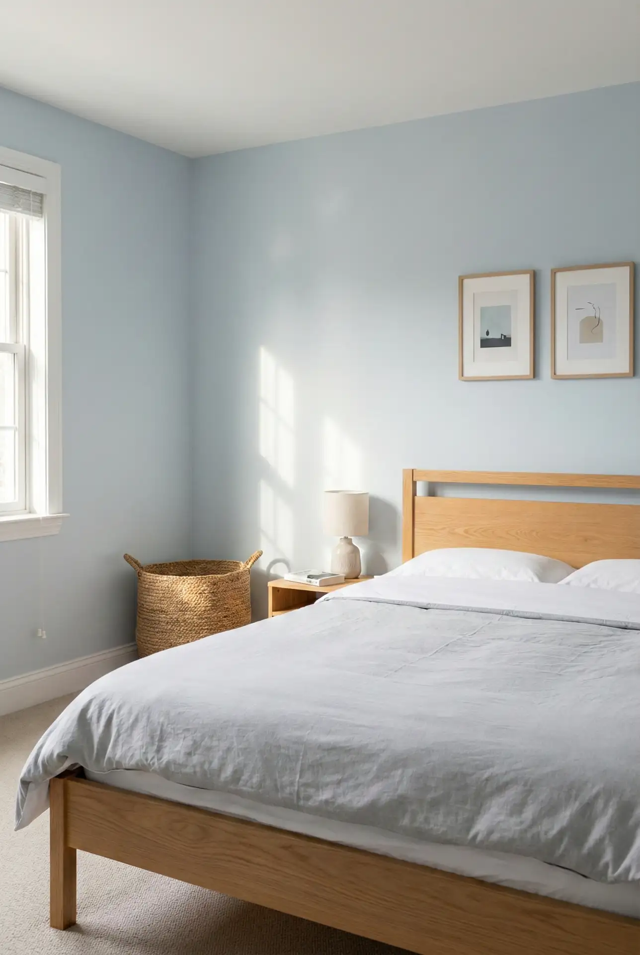
In many American homes, the guest room doubles as a home office or storage-adjacent space, and blue/gray handles that reality gracefully. It looks pulled together even with a compact desk in the corner, and it won’t clash with whatever suitcase, coat, or gift bag lands on the bed for a weekend. Keep the shades light enough to feel open, especially in smaller rooms.
6. Terracotta Warmth With Cozy Neutrals That Don’t Feel Orange

Terracotta brings instant warmth, but the most livable version is tempered with Cozy neutral layers—oatmeal bedding, soft creams, and sandy wood tones. Instead of painting every wall, try terracotta on a single wall or through textiles and art. This creates a sun-baked glow that feels inviting, not overpowering or overly Southwestern. 
A common mistake is pairing terracotta with stark white, which can make it read loud and pumpkin-like. Instead, choose creamy whites and muted tans so the warmth looks intentional. Also watch your bulbs: overly cool lighting will fight the clay tone at night. Warm LEDs and soft linen shades keep the palette flattering from morning through bedtime.
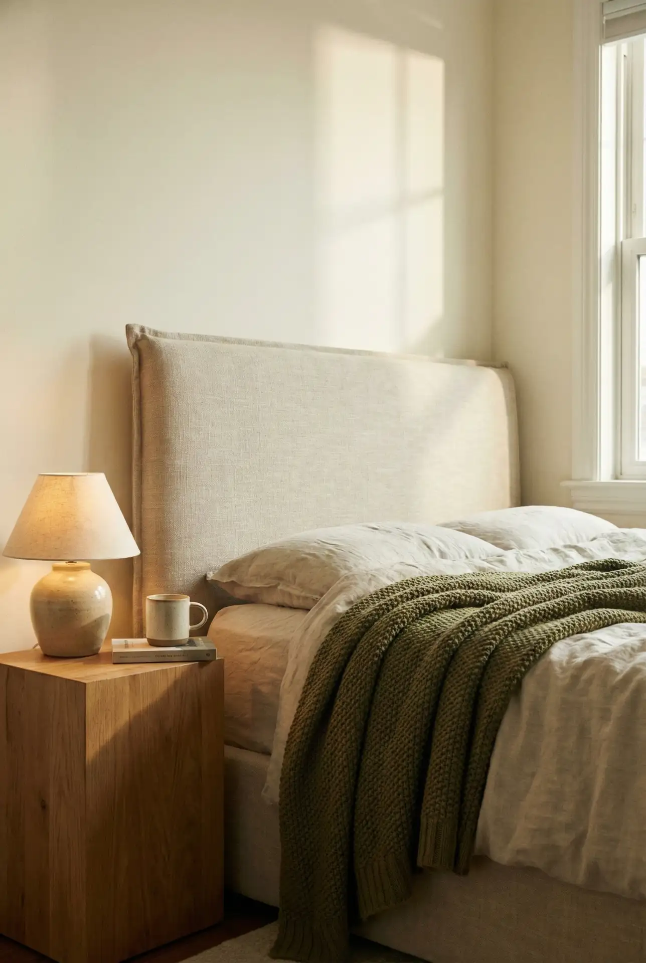
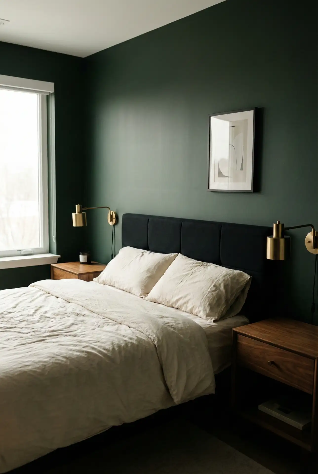
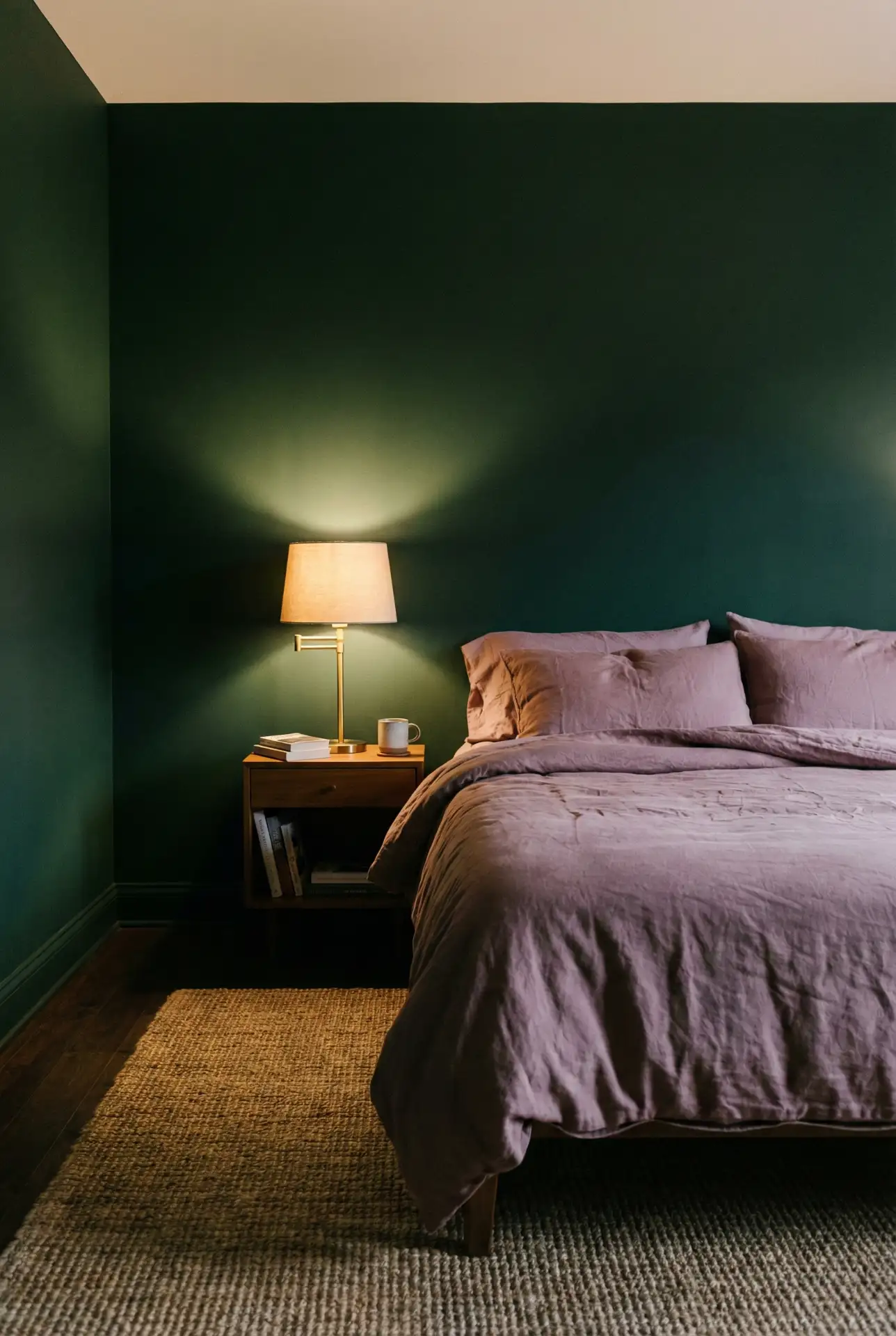
7. Dark Green Retreat With A Gray Headboard And Relaxing Texture
A Dark green wall paired with a gray headboard creates a modern retreat that still feels soft, especially when you add Relaxing texture—brushed cotton bedding, a plush rug, and matte ceramics. Keep the green slightly muted so it reads like a cocoon, then brighten the room with warm wood and pale linen curtains. 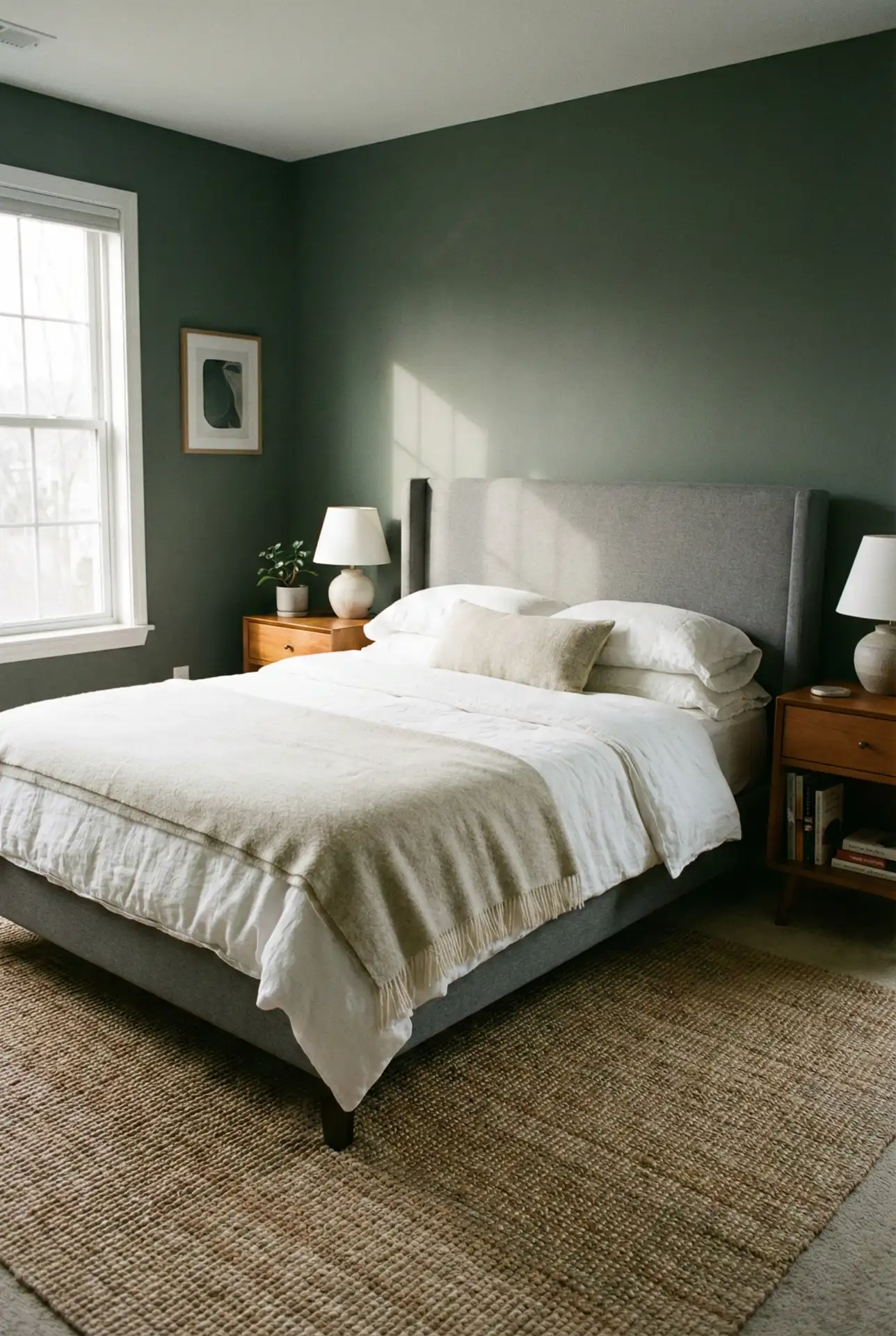
Homeowners tend to love this palette because it “hides life” in the best way—wrinkles in bedding, a book on the nightstand, and even a charging cable look less messy against dark green. The trick is keeping surfaces minimal so it stays restful, not cave-like. Add one light-catching element (a mirror or brass sconce) to keep the room from feeling too flat.
8. Cozy Olive Neutrals With A Beige Headboard For Easy Layering
This scheme uses Olive as a quiet supporting color—think throws, pillows, or a painted nightstand—paired with a Beige headboard and overall Cozy neutrals. It’s ideal if you like calm rooms but still want a hint of color. Add warm metals and creamy walls, and the olive reads sophisticated instead of rustic. 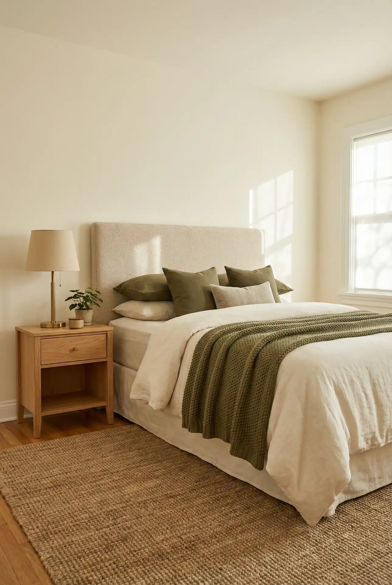
Quick story: I once watched a friend redecorate by swapping only textiles—no paint, no new furniture—and the room looked entirely new in an hour. That’s the magic of this palette. Because the base is neutral, you can seasonally rotate olive with warmer or cooler accents, and the beige headboard stays the steady “background actor” that makes everything look cohesive.
9. Dark And Classy Contrast With Black Headboard And Soft Mauve Accent s
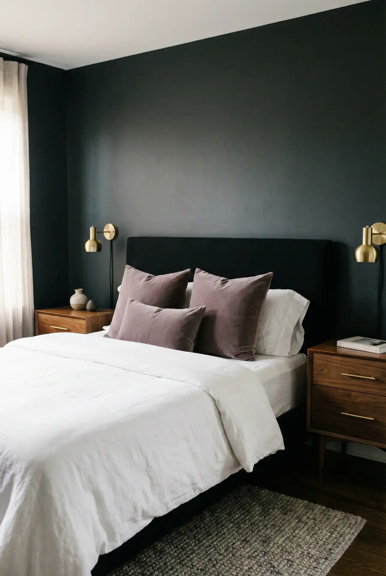
If you like a darker, moodier bedroom but don’t want it to feel severe, mix charcoal walls with a Black headboard and a whisper of Mauve in textiles. The contrast reads sleek and Classy , especially with warm lighting and natural wood. Keep patterns minimal so the palette feels intentional, not busy. 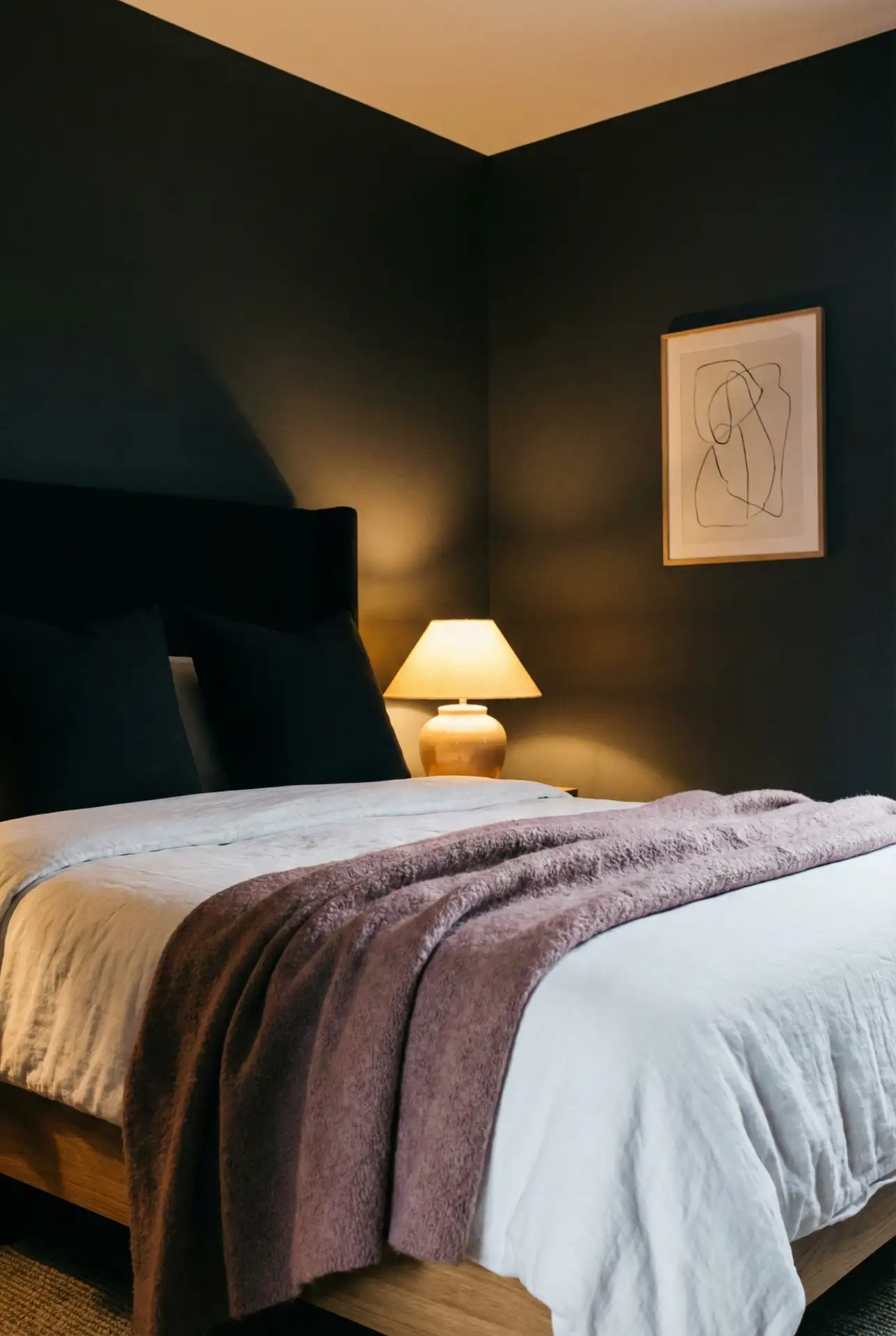
For practical results, treat dark paint like a “finish material,” not just a color. Use a higher-scrub paint finish where hands touch the wall, and keep your trim crisp so the room looks sharp rather than gloomy. Also, place at least two warm light sources at different heights—one overhead isn’t enough in a dark palette, and it can make shadows feel harsh.
10. Teal Meets Terracotta In An Earthy Modern Mix
This color pairing is a standout for bedroom color schemes 2026 : grounded Terracotta warmth balanced by cool Teal , all tied together with an Earthy neutral base. Use teal in paint or bedding, terracotta in art and ceramics, and keep the big surfaces calm with creamy walls and natural wood. It feels creative, but still grown-up. 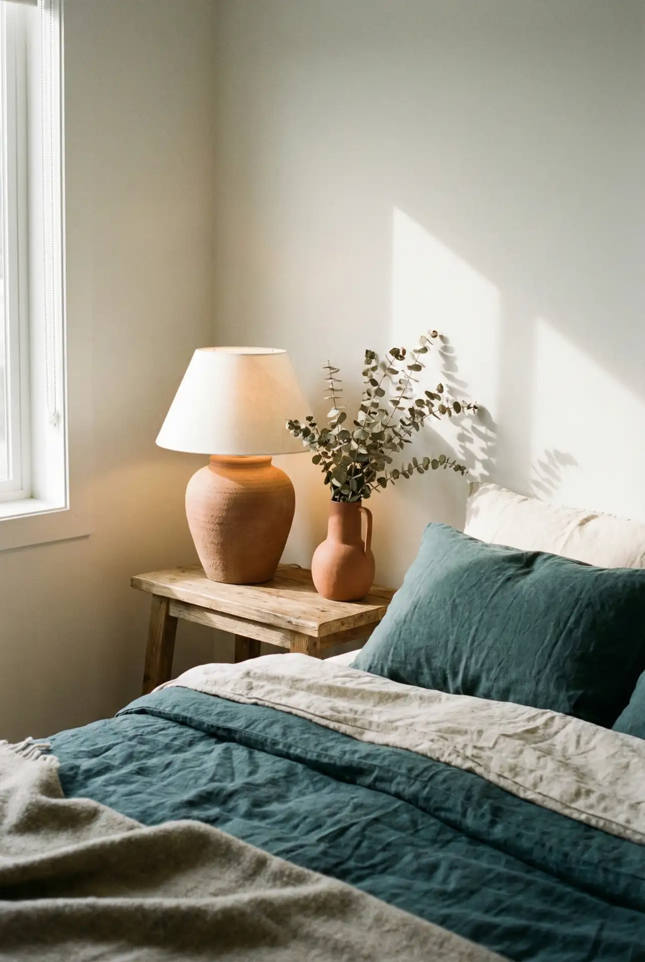
From an expert perspective, this mix works because teal and terracotta sit in different temperature families, so your eye reads “balanced” instead of “busy.” Keep one color dominant and the other as an accent—roughly 70/30—so the room doesn’t feel like a color contest. If you want extra polish, repeat each color at least twice (pillows + art, vase + rug detail) for cohesion.
11. Cozy Neutral Canvas With A Beige Headboard And Olive Accents
A Cozy neutral base makes the bedroom feel instantly calm, especially when a Beige headboard sets a soft focal point. Bring in Olive through pillows, a throw, or a framed print so the scheme has life without turning loud. Creamy whites, pale oak, and warm lighting keep it Pinterest-pretty while still looking effortless in real life. 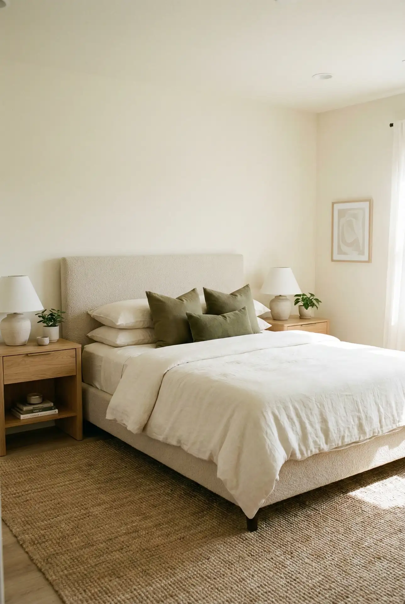
Where it works best: this scheme works best in smaller bedrooms or apartments where you want the space to feel bigger and brighter. If your space has cool lighting, go for warmer cream tones so that it doesn’t end up looking gray. For the olives, it’s easiest to swap this accent seasonally so the room can change from spring-fresh to autumn-cozy without a repaint.
12. Teal And Grey Modern Calm With A Gray Headboard
This palette pairs Teal with Grey for a clean, contemporary bedroom that still feels soft. A Gray headboard helps bridge cool tones so the scheme doesn’t skew icy. Use teal on one wall or in the bedding and then layer light gray sheets, with some matte black touches and pale wood to keep the look balanced and easy to keep clean. 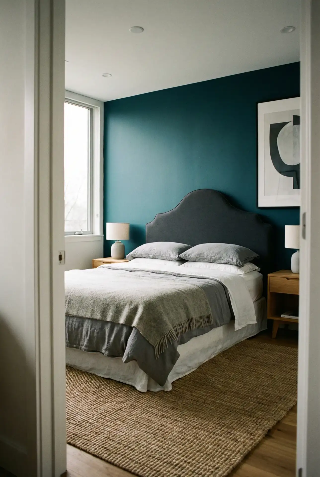
One practical move: keep teal slightly softened, not electric, so it stays relaxing at night. If the room feels too cool, add warmth through textiles—oatmeal throws, beige curtains, or a warm-toned rug. This scheme is also forgiving on busy weeks, since the colors hide everyday wrinkles and still look tidy.
13. Forest Green Cocoon With A Black Headboard And Cream Contrast
A Forest green bedroom can feel intimate and polished when a Black headboard adds structure and cream textiles lighten the mood. Keep the green on walls or paneled detailing, then bring in ivory bedding, warm wood, and a few brass touches. The result is deep and cozy without feeling like a cave, even in a standard-sized room. 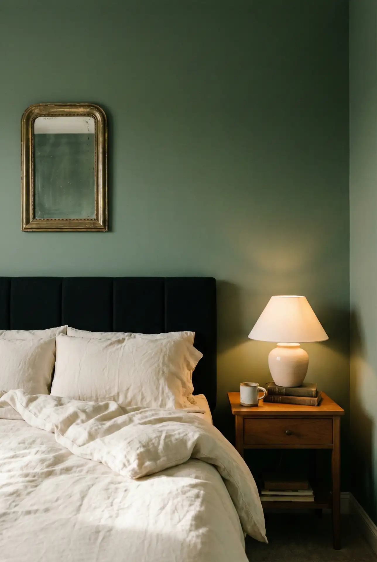
Micro anecdote: a friend once painted her bedroom forest green and worried it would “shrink” the space—then she added cream curtains and suddenly it felt like a boutique hotel. That contrast is the trick. If you’re nervous, start with one green wall behind the bed and keep everything else bright, then expand once you see it in your lighting.
14. Olive Green And Terracotta Earthy Blend For A Relaxing Feel
Pair Olive green with Terracotta for an Earthy bedroom that feels grounded and welcoming. Olive works beautifully on walls or bedding, while terracotta shows up through pottery, art, and warm-toned textiles. Keep the base neutral—cream, sand, or light wood—so the palette reads soothing, not rustic-themed. 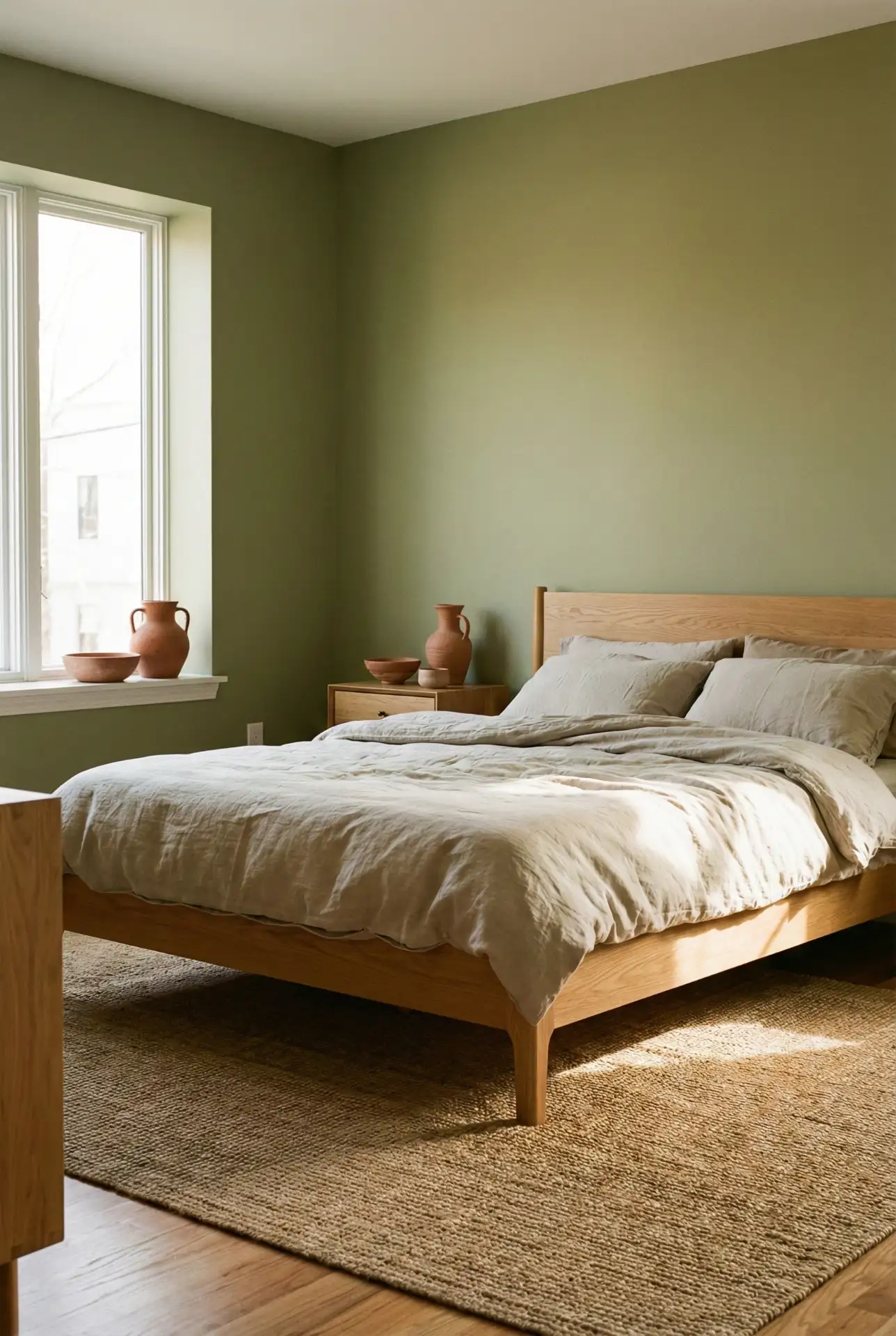
Designers often point out that earthy palettes feel best when you repeat tones in small ways. Add two or three terracotta moments (a vase, a throw, a framed print) so it doesn’t look accidental. If the room is dim, lean lighter on olive and let terracotta bring warmth through accessories instead of heavy wall color.
15. Blue Coastal Ease With A Beige Headboard And Soft Grey Details
A muted Blue palette feels breezy and timeless, and a Beige headboard keeps it grounded instead of nautical. Add touches of Grey through sheets, a rug, or drapery to soften the contrast. The overall effect is light and restorative—perfect for anyone who wants color in the room but still craves that “exhale” feeling at bedtime. 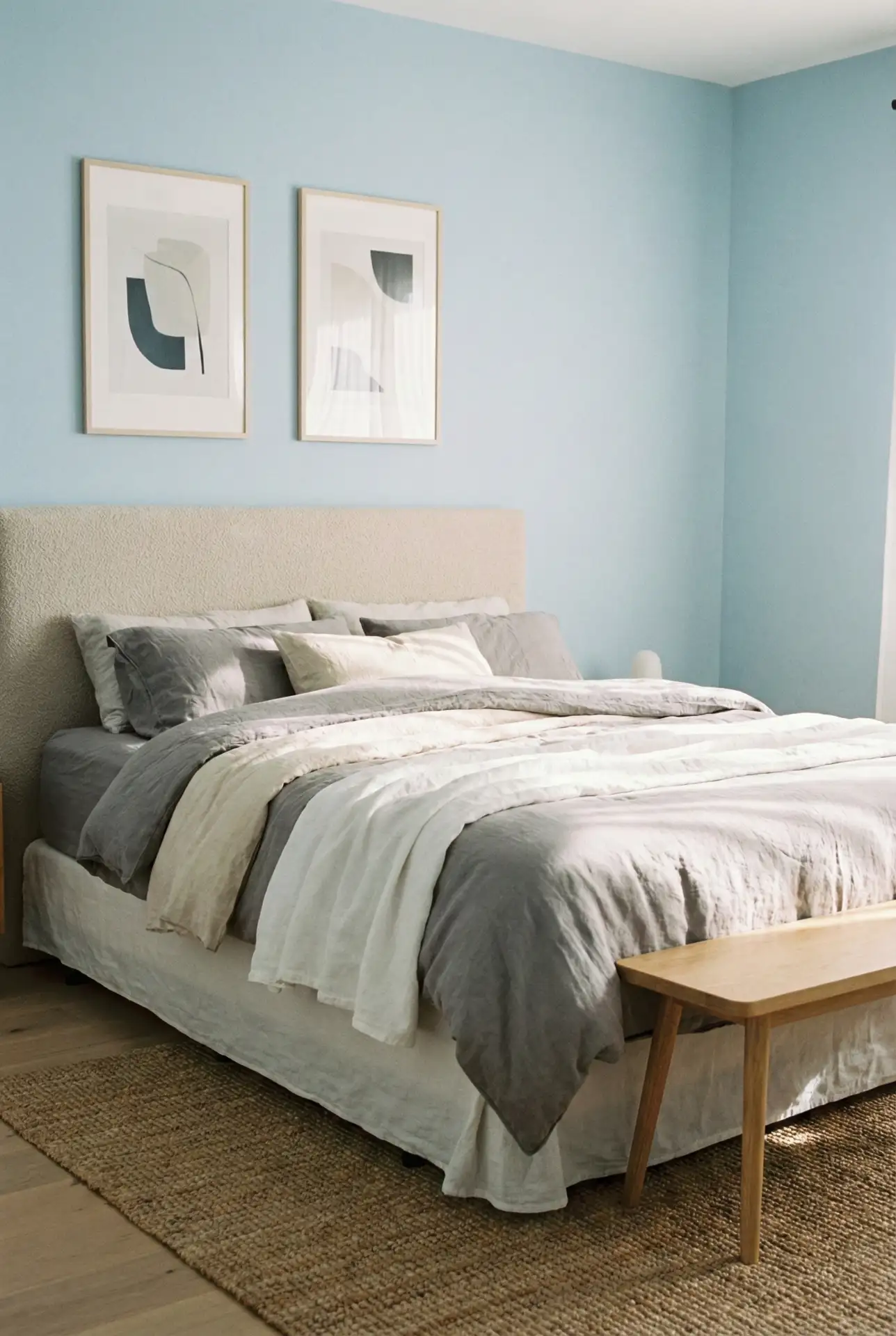
Budget/price angle: you can get this look with inexpensive swaps—blue paint or a blue quilt does most of the heavy lifting. Spend your “real money” on the headboard fabric and a rug that feels good underfoot. The beige headboard is the most visible upholstery in the room, so quality texture there makes the whole palette look elevated.
16. Dark Green And Mauve Modern Romance For Couples
This scheme pairs Dark green with Mauve accents for Couples who want something moodier than beige but softer than black. Use dark green on the walls or behind the bed, then add mauve through pillows, a throw, or art. Keep the supporting tones creamy and warm so the palette feels intimate, not heavy or overly dramatic. 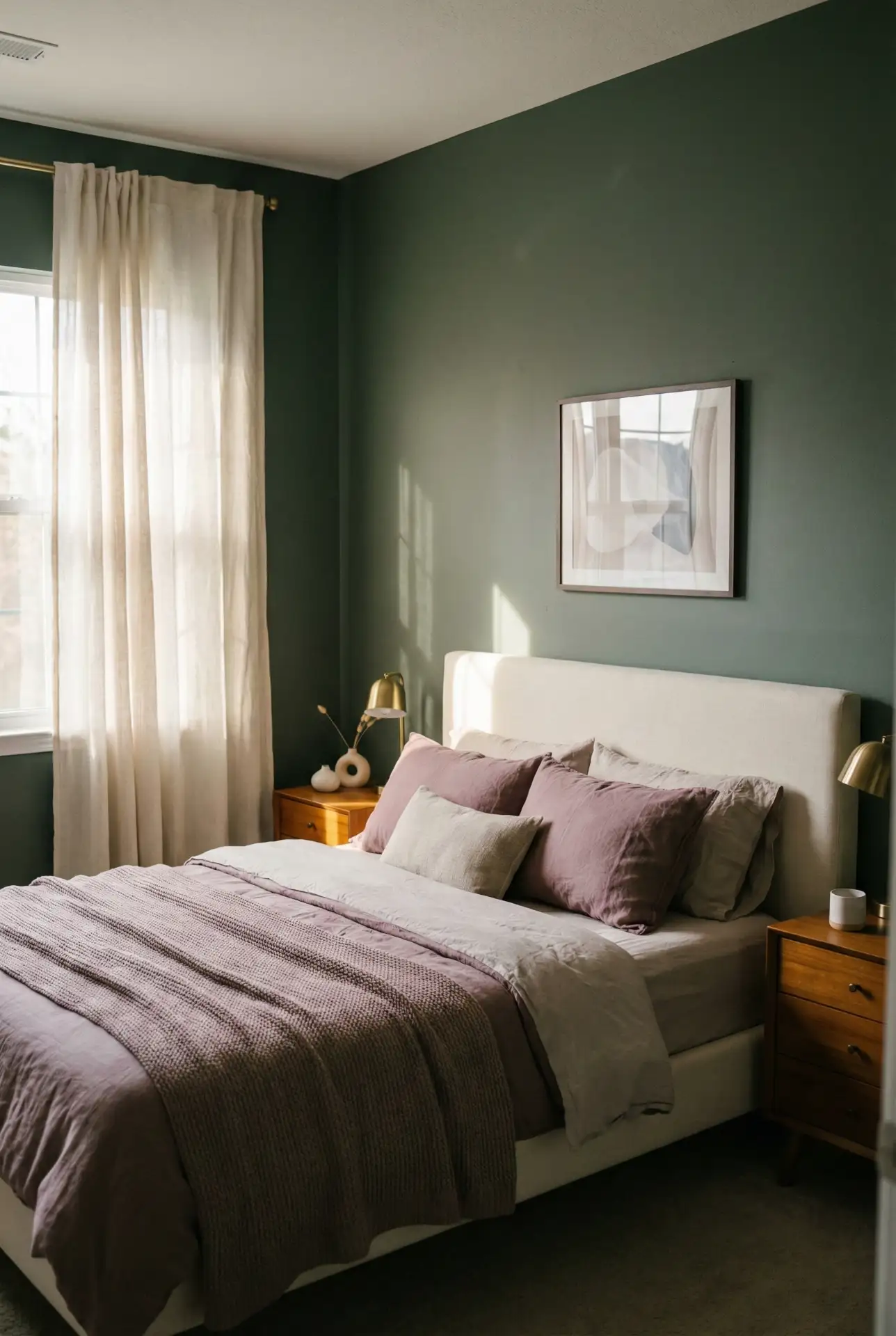
Real homeowner behavior: many couples end up compromising by choosing one “quiet” color and one “soft accent,” and this combo nails that balance. Dark green gives the room depth, while mauve keeps it from feeling too serious. If one person is color-shy, keep mauve limited to two items and let the green do the atmosphere-building.
17. Teal Statement With Terracotta Touches And A Black Headboard
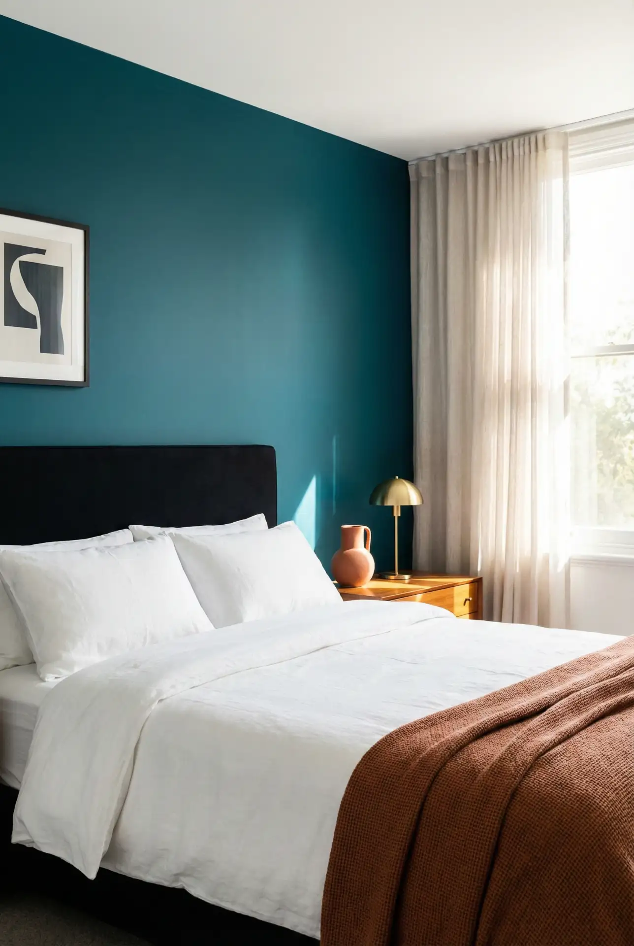
A rich Teal wall becomes a bold backdrop when paired with a Black headboard , and Terracotta accents add warmth so the room doesn’t feel cold. Think teal paint, black furniture lines, then terracotta pottery, a rust-toned throw, or warm art. The palette is modern and energetic but still bedroom-appropriate when styling stays minimal. 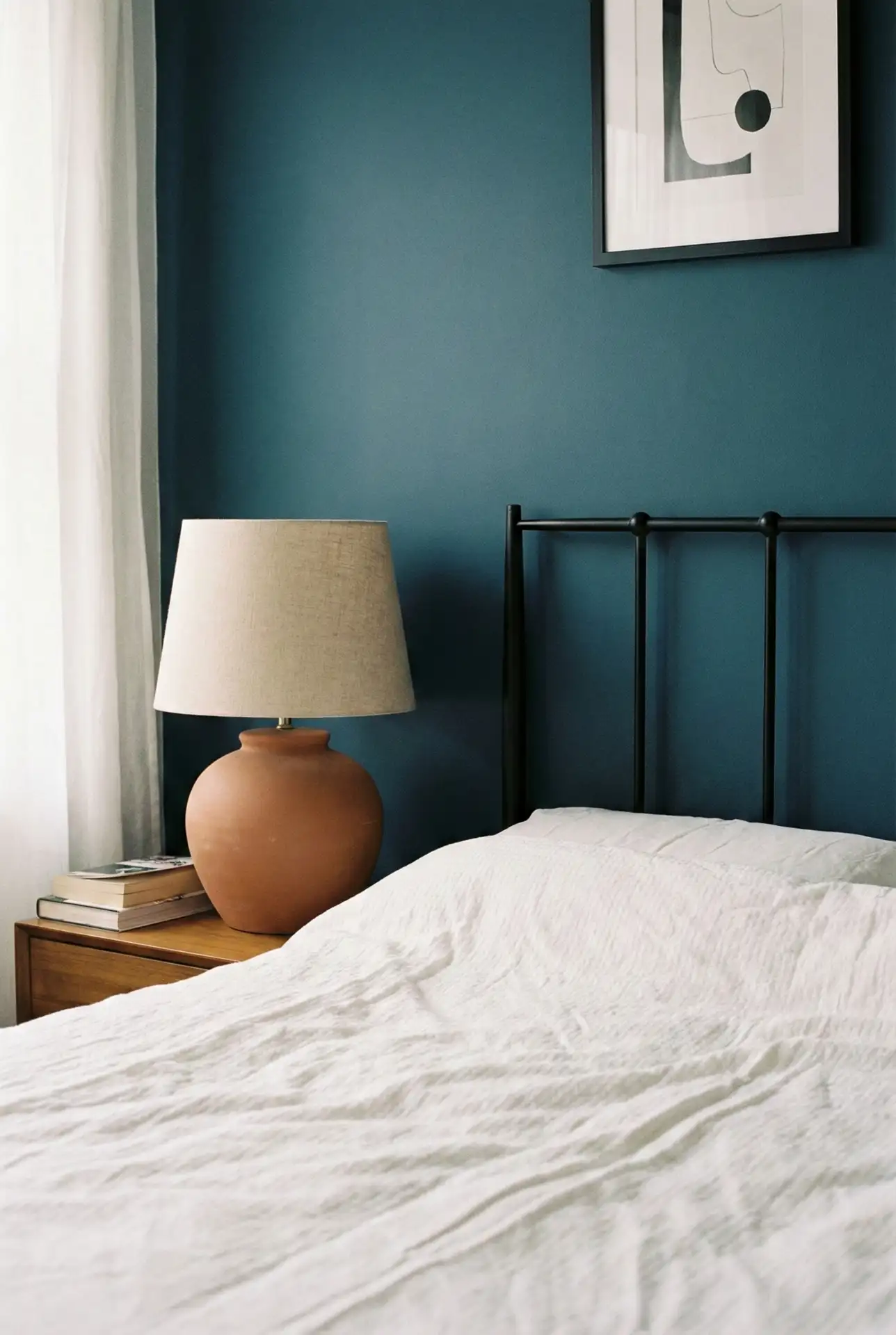
Where it works best: this scheme looks fantastic in rooms with lots of daylight or lighter floors, where teal can feel saturated without turning gloomy. If the room is small and dim, use teal on one wall only and keep the surrounding walls warm white. Terracotta accents should be repeated twice so they read as a deliberate color story.
18. Farrow & Ball-Inspired Grey With Cozy Neutral Bedding
A heritage-style Farrow and ball Grey creates a sophisticated backdrop that feels calm rather than plain, especially when you layer Cozy neutral bedding. Think stone-gray walls, creamy linens, warm oak, and soft black accents. This palette is quietly polished—perfect if you love “designer neutral” rooms that still feel warm and livable. 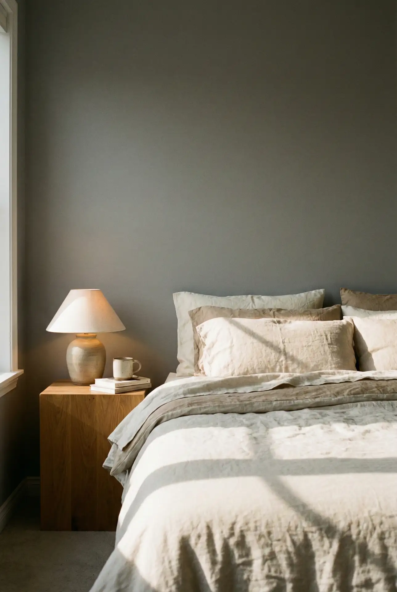
A common mistake is choosing a gray that’s too blue and then wondering why the room feels chilly. Look for a gray with a warm, stone undertone and pair it with creamy whites instead of bright white. Add at least one warm texture—wool, linen, or wood grain—so the palette looks inviting, not sterile.
19. Classy Guest Bedroom With Blue And Beige Balance
A Guest bedroom feels instantly more welcoming when it balances soft Blue with warm neutrals and a Beige headboard . Choose a dusty blue wall color, then layer crisp white sheets, beige upholstery, and a simple wood bench. The vibe is Classy but friendly—something guests can relax into without feeling like they’re in a museum. 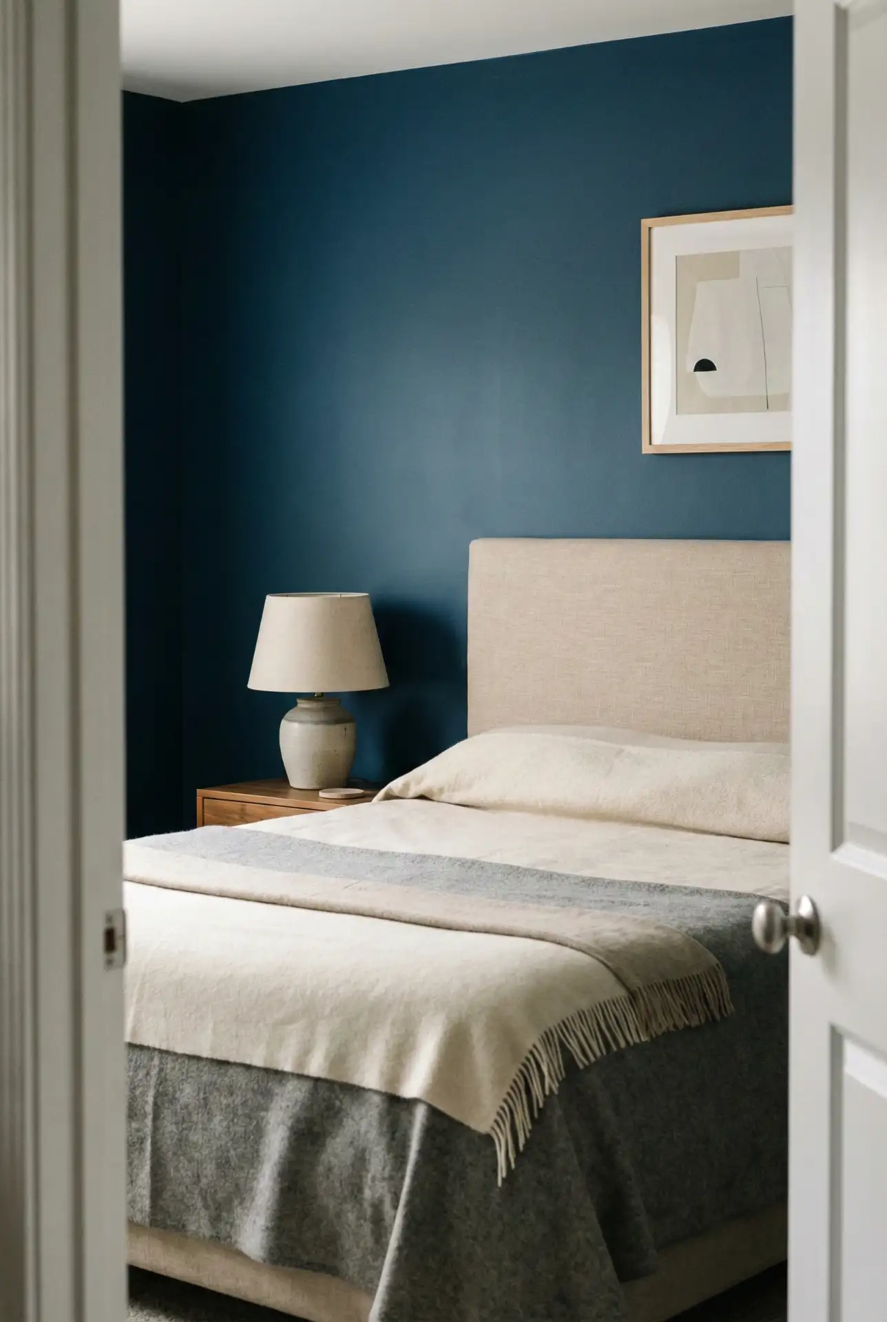
Expert-style commentary: the best guest rooms use a “low-stress palette” that looks good in any season and any light. Blue and beige does that beautifully, especially when you keep patterns minimal. Add one small comfort detail—like a carafe on the nightstand or a basket for extra blankets—so the room feels intentionally prepared, not spare.
20. Dark Olive And Grey With A Gray Headboard For A Relaxing Modern Look
This palette combines Dark olive walls with Grey layers and a Gray headboard for a modern bedroom that feels calm, not stark. Keep bedding light—creams and soft grays—then add warm wood and muted brass so the darkness reads cozy. The olive undertone makes the room feel more organic than standard charcoal or black. 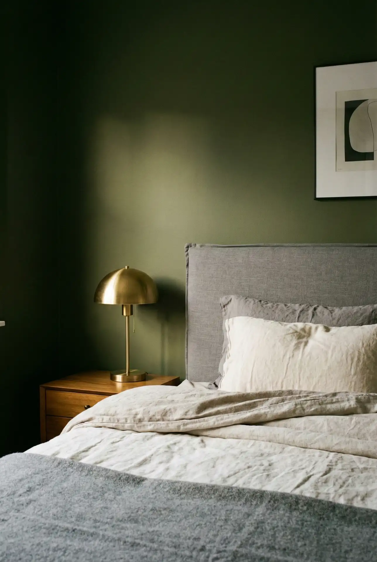
Practical insight: the easiest way to keep dark olive from feeling heavy is to control contrast. Choose trim and bedding that are creamy rather than bright white, and add at least two light sources (one on each side of the bed) so shadows stay soft. If you’re unsure, paint the wall behind the headboard first—a dark color feels more intentional when it frames the bed.
21. Earthy Teal And Forest Green Layers For A Cozy, Classy Bedroom
If you want color without being too flashy, try Teal in textiles and a deeper Forest Green on one wall or headboard. To keep the scheme earthy and cozy, add warm oak, creamy cotton, and soft lamplight. The result is a calm, visually rich bedroom that looks luxurious even without excessive decor. 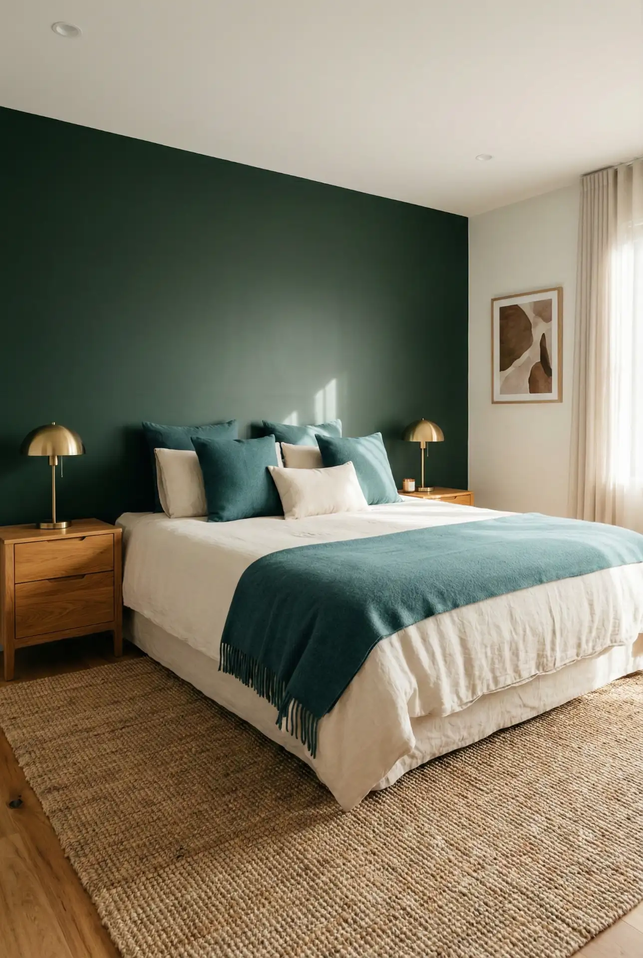
A frequent issue is incorporating too many light-toned colors, creating an “office” environment. To combat this, keep greens muted, and use warm neutrals, such as cream over crisp white and honey oak rather than gray wood. This will make the colors look relaxing and cohesive, as opposed to clashing.
When considering a bedroom color palette, there are no trends to follow; it is more about the feeling you want to evoke when you step inside the room, lower the lights, and take a deep breath. If you plan to use one of these palettes (or a combination of a few), let me know in the comments what the light and color of the room are. Your comments will assist other readers in making a confident choice.